The Psychology of Store Layout: How Design Influences Shopping Behaviour
Posted On: June 25, 2024 By: blueprint_admin

Creating an effective store layout is more than just arranging shelves and displays; it’s about understanding and influencing consumer behaviour. And to do this, you need to consider how people think and what inspires them to spend more time in your premises. By digging deep into psychological principles, you can design a space that improves the shopping experience for your customers and encourages them to spend more time and money.
The Basics of Store Layout and How It Affects Consumer Behaviour
The layout of a shop significantly impacts how customers interact with the space and products. Here are a few key principles:
- The Decompression Zone: This is the area just inside the entrance where customers transition from the outside world to the shop environment. It’s crucial to keep this space clear and inviting to help shoppers acclimatise to your store and prepare for the shopping experience.
- Store Layout Types: There are several common store layouts, including the grid, free-flow, loop (racetrack) and spine. Each layout has unique advantages depending on the type of store and where you want to guide your customers. For instance, grid layouts are efficient for supermarkets where you want shoppers to be able to find their favourite items week after week, while free-flow layouts encourage customers to explore in fashion boutiques.
- Product Placement: Place high-demand and high-margin items at eye level and in prominent locations. End caps and displays near the tills can also drive impulse purchases. Make sure you organise the shop to sell the most product.
- Aisle Width and Length: Wider aisles create a more comfortable and accessible shopping experience, while the length of the aisle can affect how much of the shop customers explore. Short, wide aisles can make the store feel less overwhelming and more navigable.
- Sensory Elements: Lighting, music and scent all play crucial roles in shaping the shopping experience. Warm lighting can make a store feel inviting, while upbeat music can energise shoppers. Pleasant scents can enhance mood and even increase sales of certain products.
How to Use the Principles of Psychology to Your Advantage
Understanding and applying psychological principles can enhance your shop layout and boost your sales:
- Path to Purchase: Guide customers through the shop in a way that maximises exposure to products. This can be achieved by creating a clear path that leads shoppers past key displays and through different sections of the store.
- Cross-Merchandising: Group related products together to encourage additional purchases. For example, placing pasta near sauces and cooking utensils can inspire shoppers to buy more items they didn’t initially plan to buy.
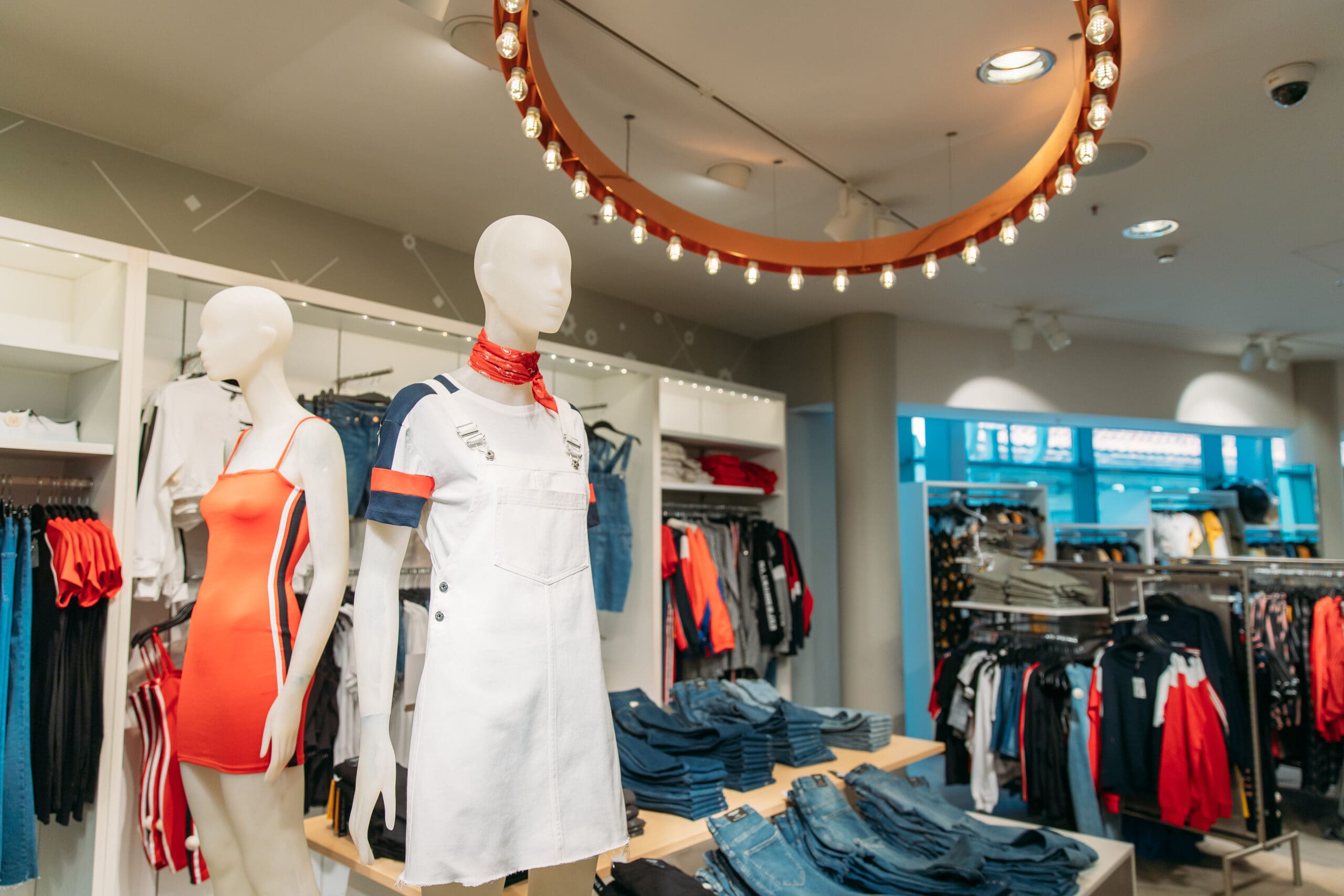
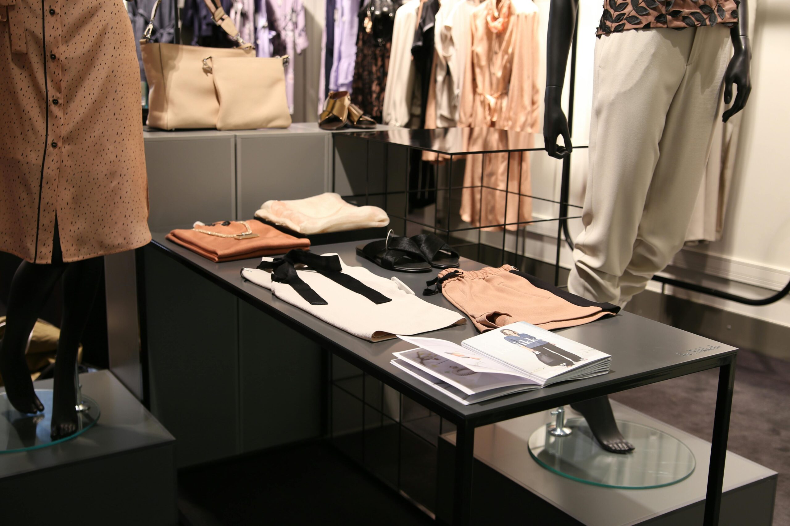
- Visual Merchandising: Use attractive displays and strategic lighting to highlight key products. Change displays regularly to keep the shop looking fresh and interesting. The visual appeal can draw customers in and make products more enticing.
- Comfort and Convenience: Provide seating areas and clear signage to enhance the shopping experience. Comfortable customers are likely to spend more time in the store, increasing the likelihood of purchases.
Examples of Businesses That Have Successfully Used Store Layout to Increase Profits
Many successful retailers have mastered the art of store layout to boost sales and enhance customer satisfaction:
- Apple Stores use a minimalist layout with plenty of open space, encouraging customers to interact with products. The layout is designed to create an inviting atmosphere that makes customers feel comfortable spending time exploring devices.
- IKEA’s maze-like layout guides customers through various room settings, showcasing products in real-life contexts. This layout encourages customers to spend more time in the shop, increasing the chances of making additional purchases.
- Starbucks creates a cosy, inviting atmosphere with comfortable seating and warm lighting. The layout encourages customers to relax and stay longer, often leading to repeat purchases during their visit.
- Some supermarkets use the “racetrack” layout, which guides customers around the perimeter of the store where fresh and high-margin products are placed. Others opt for the grid that allows shoppers to move through the aisles methodically, finding the products they want with ease.
- Luxury boutiques often use free-flow layouts with elegant displays and strategic lighting to create an exclusive shopping experience. This layout encourages browsing and highlights the quality of the merchandise.
Sort Your Layout
A well-designed store layout can significantly influence shopping behaviour, leading to increased sales and improved customer satisfaction. By understanding psychological principles, and learning from successful examples, you can create spaces that not only attract customers but also encourage them to explore, engage and spend more.
Talk to The Retail Factory about how we can help you create the perfect layout today. Call 0800 0223237.
Latest Posts
- Gridwall vs Slatwall: Choosing the Right…
- Display Plinths Explained: When and How…
- Spring Retail Window Displays: Fresh Visual…
- How to Prepare Your Store for…
- Sports Retail Display Strategies: From Athleisure…
- Charity Shop Setup: Essential Retail Equipment…
- Mannequin Psychology: How Body Form Selection…
- The Complete Hanger Guide: Matching Hanger…
- The Hidden Cost of Poor Merchandising:…
- One Fixture, Five Uses: How to…


